<head>
    <meta charset="UTF-8">
    <title>Document</title>
    <style>
        dt, dd{
            display: inline;
        }
        dd{
            font-weight: bold;
            margin: 0px 0px 0px 5px;
        }
        dd + dt::before{
            content: ’\A’;
            white-space: pre; /*html默认换行符与其相邻的其他空白符合并,pre表示不合并空白符*/
        }
        dd + dd::before{
            content: ’,’;
            margin-left: -5px;
        }
    </style>
</head>
<body>
    <dt>Name</dt><dd>Sam Long</dd>
    <dt>Email</dt><dd>abc@163.com</dd><dd>bcd@163.com</dd>
    <dt>Location</dt><dd>CQ</dd>
</body>
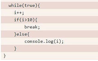
<head>
    <meta charset="UTF-8">
    <title>Document</title>
    <style>
        .wrap{
            padding: .5em;
            line-height: 1.5;
            background: hsl(20, 50%, 95%);
            background-image: linear-gradient(
                            rgba(120,0,0,.1) 50%, transparent 0);
            background-size: auto 3em;
            background-origin: content-box;
            font-family: Consolas, Monaco, monospace;
        }
        .wrap code{
            font: inherit;
        }
    </style>
</head>
<body>
<pre class="wrap"> <code> while(true){
    i++;
    if(i>10){
        break;
    }else{
        console.log(i);
    }
}</code></pre>
</body>
<head>
    <meta charset="UTF-8">
    <title>Document</title>
    <style>
        pre, code{
            font-family: monospace;
        }
        pre{
            white-space: pre;
            background: red;
            tab-size: 2;
            display: block;
        }
    </style>
</head>
<body>
<pre><code>
while(true){
    var d = new Date();
}
</code></pre>
</body>

<head> <meta charset="UTF-8"> <title>Document</title> <style> body { font: 250%/1.6 Baskerville, Palatino, serif; } a { background: -webkit-linear-gradient(gray, gray) no-repeat; background-size: 100% 1px; background-position: 0 1.02em; text-shadow: .05em 0 white, -.05em 0 white;
/*水平左、右偏移一个背景色的阴影,用于降级字母的下半处理*/ } p:nth-child(2) a { background: -webkit-linear-gradient(180deg, gray 66%, transparent 0) repeat-x;
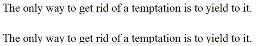
/*0,180deg都是可以的*/ background-size: .2em 2px; background-position: 0 1em; } </style> </head> <body> <p>The only way to <a>get rid of a temptation</a> is to <a>yield</a> to it.</p> <p>The only way to <a>get rid of a temptation</a> is to <a>yield</a> to it.</p> </body>
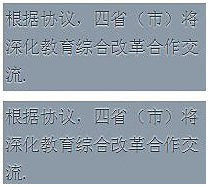
<head>
    <meta charset="UTF-8">
    <title>Document</title>
    <style>
        body{
            font: 110%/1.6 Baskerville, Palatino, serif; /*字体过小表现不出样式*/
        }
        .wrap{
            width: 200px;
            background: hsl(210, 13%, 60%);
            color: hsl(210, 13%, 30%);
            padding: .1em;
            text-shadow: 0 1px 1px hsla(0, 0%, 100%, .8);
        }
        .wrap02{
            margin-top: 10px;
            width: 200px;
            background: hsl(210, 13%, 60%);
            color: hsl(210, 13%, 30%);
            padding: .1em;
            text-shadow: 0 -1px 1px hsla(0, 0%, 100%, .8);
        }
    </style>
</head>
<body>
    <div class="wrap">
        <span>根据协议,四省(市)将深化教育综合改革合作交流.</span>
    </div>
    <div class="wrap02">
        <span>根据协议,四省(市)将深化教育综合改革合作交流.</span>
    </div>
</body>
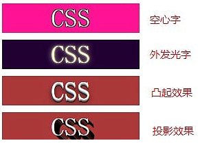
<head>
    <meta charset="UTF-8">
    <title>Document</title>
    <style>
        .wrap{
            text-align: center;
            font-size: 38px;
            width: 200px;
            background: deeppink;
            color: white;
            text-shadow: 1px 1px black, -1px 1px black, -1px -1px black, 1px -1px black;
        }
        .wrap02{
            margin-top: 10px;
            font-size: 38px;
            width: 200px;
            text-align: center;
            background: #203;
            color: #ffc;
            transition: 1s;
        }
        .wrap02:hover{
            text-shadow: 0 0 .1em, 0 0 .3em;
            color:transparent;
        }
        .wrap03{
            margin-top: 10px;
            width: 200px;
            font-size: 38px;
            text-align: center;
            color: white;
            background: hsl(0,50%,45%);
            text-shadow: 0 1px hsl(0, 0%, 85%),
                         0 2px hsl(0, 0%, 65%),
                         0 3px hsl(0, 0%, 45%),
                         0 4px hsl(0, 0%, 25%),
                         0 5px hsl(0, 0%, 5%),
                         0 5px 10px black;
        }
        .wrap04{
            margin-top: 10px;
            width: 200px;
            font-size: 38px;
            text-align: center;
            color: white;
            background: hsl(0,50%,45%);
            text-shadow: 1px 1px black, 2px 2px black,
                         3px 3px black, 4px 4px black,
                         5px 5px black, 6px 6px black,
                         7px 7px black, 8px 8px black;
        }
    </style>
</head>
<body>
    <div class="wrap">
        <span>CSS</span>
    </div>
    <div class="wrap02">
        <span>CSS</span>
    </div>
    <div class="wrap03">
        <span>CSS</span>
    </div>
    <div class="wrap04">
        <span>CSS</span>
    </div>
</body>
<head>
    <meta charset="UTF-8">
    <title>Document</title>
    <style>
        input[type="checkbox"]{
            display: none;
        }
        input[type="checkbox"] + label::before{
            content: ’\a0’; /*不换行空格*/
            display: inline-block;
            background: silver;
            border-radius: .2em;
            margin-right: .2em;
            width: .8em;
            height: .8em;
            line-height: .65em;
            text-indent: .15em;
        }
        input[type="checkbox"]:checked + label::before{
            content: ’\2713’;
            background: yellowgreen;
        }
    </style>
</head>
<body>
    <input type="checkbox" id="anesome"/>
    <label for="anesome">anesome</label>
</body>
<head>
    <meta charset="UTF-8">
    <title>Document</title>
    <style>
        input[type="checkbox"]{
            display: none;
        }
        input[type="checkbox"] + label{
            display: inline-block;
            padding: .3em .5em;
            background: #ccc;
            border: 1px solid rgba(0, 0, 0, .2);
            background-image: linear-gradient(#ddd,#bbb);
            text-align: center;
            border-radius: .3em;
            box-shadow: 0 1px white inset;
            text-shadow: 0 1px 1px white;
        }
        input[type="checkbox"]:checked + label{
            box-shadow: .05em .1em .2em rgba(0, 0, 0, .6) inset;
            border-color: rgba(0, 0, 0, .3);
            background: #bbb;
        }
    </style>
</head>
<body>
    <input type="checkbox" id="anesome"/>
    <label for="anesome">anesome</label>
</body>

【 微信扫一扫 】