*以下技巧均源自于Lea Verou所著《CSS Secrets》
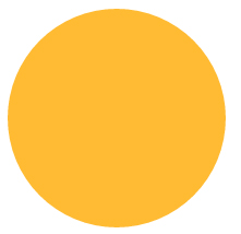
在css上构造圆形只需要将border-radius属性值设为边长的一半即可。
<!DOCTYPE html>
<html lang="en">
<head>
    <meta charset="UTF-8">
    <title>border-radius</title>
    <style>
        .borderRadius{
            display: inline-block;
            background: #fb3;
            min-width: 200px;
            height: 200px;
            line-height: 200px;
            border-radius: 100px; /* 边长的一半 */
            box-sizing: border-box;
            padding:0 5px;
        }
    </style>
</head>
<body>
    <div class="borderRadius">
       <div class="innerTxt"></div>
    </div>
</body>
</html>
显示效果如下:
以上布局当我们在innerTxt中添加过多的内容时,会得到如下的效果:

如果我们想要一个自适应的椭圆的话,那么border-radius中就不应该是一个固定的值,
当我们将border-radius设置为50%时,显示效果如下:
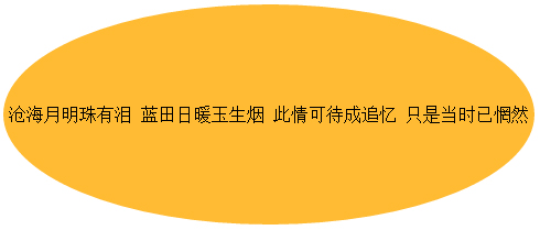
这样就变成了一个自适应的椭圆了。
这里我们全面介绍一下border-radius的属性,border-radius是一个简写属性,
它的展开式是border-top-left-radius、border-top-right-radius、border-bottom-right-radius、border-bottom-left-radius。
它还有一个鲜为人知的特性:border-radius可以单独指定水平和垂直半径,
只要用一个斜杠( / )分隔这两个值即可(圆形圆角水平和垂直半径相等,可以合并)。
结合这这些特性来看的话,border-radius:50%;的详细展开应该是border-radius:50% 50% 50% 50%/50% 50% 50% 50%。
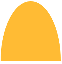
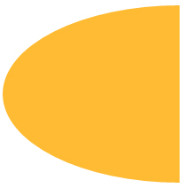
接下来我们根据已知的圆角特性发挥想象构建各种各样的图形。
border-radius: 50% / 100% 100% 0 0(当圆角半径不满4个时,css会自动帮你重复)
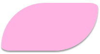
border-radius: 100% 0 0 100% / 50%;
border-radius:
 糖果按钮
糖果按钮
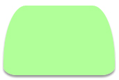
当实际应用时,充分利用圆角的特性加上一些想象,就可以构造出可爱的糖果按钮效果了。
.borderRadius{
            display: inline-block;
            background: rgba(255,160,220,.8);
            box-shadow: hsl(0, 0%, 60%) 0 3px 3px;
            min-width: 200px;
            height: 100px;
            line-height: 200px;
            border-radius: 50% 10% / 100% 10%;
        }
.borderRadius{
            display: inline-block;
            background: rgba(157, 255, 127, 0.8);
            box-shadow: hsl(0, 0%, 60%) 0 3px 3px;
            min-width: 160px;
            height: 100px;
            line-height: 200px;
            border-radius: 20% 20% 12% 12%/ 80% 80% 12% 12%;
        }
.borderRadius{
            display: inline-block;
            background: rgba(167, 255, 250, 0.8);
            box-shadow: hsl(0, 0%, 60%) 0 3px 3px;
            min-width: 160px;
            height: 100px;
            line-height: 200px;
            border-radius: 20% / 50%;
        }
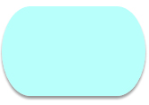
是不是挺可爱的,这样就不用经常劳烦美工同志做图啦,
但是在应用之前一定要确认适用的游览器支持圆角属性。

【 微信扫一扫 】