对元素进行移动、缩放、转动、拉长或拉伸。
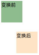
元素从其当前位置移动,根据给定的 left(x 坐标) 和 top(y 坐标) 位置参数
有两个div,它们的css样式如下:
.before {
            width: 70px;
            height: 70px;
            background-color: #8fbc8f;
        }

 .after {
            width: 70px;
            height: 70px;
            background-color: #ffe4c4;
            -webkit-transform: translate(50px, 30px);
            -moz-transform: translate(50px, 30px);
            -ms-transform: translate(50px, 30px);
            -o-transform: translate(50px, 30px);
            transform: translate(50px, 30px);
        }
结果如下:
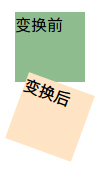
元素顺时针旋转给定的角度。允许负值,元素将逆时针旋转。
有两个div,它们的css样式如下
.before {
            width: 70px;
            height: 70px;
            background-color: #8fbc8f;
        }

.after {
            width: 70px;
            height: 70px;
            background-color: #ffe4c4;
            -webkit-transform: rotate(20deg);
            -moz-transform: rotate(20deg);
            -ms-transform: rotate(20deg);
            -o-transform: rotate(20deg);
            transform: rotate(20deg);
        }
结果如下:
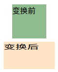
元素的尺寸会增加或减少,根据给定的宽度(X 轴)和高度(Y 轴)参数
有两个div,它们的css样式如下:
.before {
            width: 70px;
            height: 70px;
            background-color: #8fbc8f;
        }

.after {
            width: 70px;
            height: 70px;
            background-color: #ffe4c4;
            -webkit-transform: scale(1.5, 0.8);/*宽度变为原来的1.5倍,高度变为原来的0.8倍*/
            -moz-transform: scale(1.5, 0.8);
            -ms-transform: scale(1.5, 0.8);
            -o-transform: scale(1.5, 0.8);
            transform: scale(1.5, 0.8);
        }
结果如下:
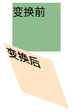
元素翻转给定的角度,根据给定的水平线(X 轴)和垂直线(Y 轴)参数
.before {
            width: 70px;
            height: 70px;
            background-color: #8fbc8f;
        }

.after {
            width: 70px;
            height: 70px;
            background-color: #ffe4c4;
            -webkit-transform: skew(20deg, 20deg);/*围绕 X 轴把元素翻转20度,围绕 Y 轴翻转20度*/
            -moz-transform: skew(20deg, 20deg);
            -ms-transform: skew(20deg, 20deg);
            -o-transform: skew(20deg, 20deg);
            transform: skew(20deg, 20deg);
        }
结果如下:
元素从一种样式逐渐改变为另一种的效果
有一个div,它的css样式如下:
div {
            width:100px;
            height:100px;
            background-color: #87cefa;
            -webkit-transition: width 2s;/*时长为2s的宽度变化效果*/
            -moz-transition: width 2s;
            -o-transition: width 2s;
            transition: width 2s;
        }
div:hover{
            width:300px;
        }

【 微信扫一扫 】